Notice
Recent Posts
Recent Comments
Link
| 일 | 월 | 화 | 수 | 목 | 금 | 토 |
|---|---|---|---|---|---|---|
| 1 | 2 | 3 | 4 | |||
| 5 | 6 | 7 | 8 | 9 | 10 | 11 |
| 12 | 13 | 14 | 15 | 16 | 17 | 18 |
| 19 | 20 | 21 | 22 | 23 | 24 | 25 |
| 26 | 27 | 28 | 29 | 30 | 31 |
Tags
- 보조정렬
- MSSQL
- NPM
- 공정능력
- SPC
- R
- Sqoop
- GIT
- es6
- Express
- hadoop
- tomcat
- vaadin
- maVen
- Python
- Java
- mybatis
- Spring
- 정렬
- Eclipse
- IntelliJ
- SQL
- Kotlin
- table
- react
- JavaScript
- window
- xPlatform
- Android
- mapreduce
Archives
- Today
- Total
DBILITY
독거 가능성 100% 노후에 라면값이라도 하게 센스를 발휘합시다!😅
Please click on the ad so that I can pay for ramen in my old age!
点击一下广告,让老后吃个泡面钱吧!
老後にラーメン代だけでもするように広告を一回クリックしてください。
react styled component 본문
반응형
https://styled-components.com/
styled-components
Visual primitives for the component age. Use the best bits of ES6 and CSS to style your apps without stress 💅🏾
styled-components.com
외부에 css,scss를 만들고 id,class로 참조하지 않고, 콤포넌트 내부에서 콤포넌트를 이름을 사용하는 것처럼 지정하는 것이다. 말이 복잡하다. 내부에 있기 때문에 전역적으로 중첩(꼬이는ㅋㅋ)되지 않게 사용할 수 있다. 이게 전부인가?
일단 설치한다.
npm install styled-components콤포넌트내에서 사용할 style을 대충 만들어 본다.
import styled from "styled-components";

const Example = (props) => {
  const bgColor = "yellow";

  const MyButton = styled.button`
    background: ${bgColor};
    color: black;
    height: 40px;
    padding: 5px;
    border-radius: 5px;
    margin-top: 10px;
  `;
  const MyBox = styled.div`
    background: grey;
    padding: 20px;
    border-radius: 5px;
    margin: 10px;
  `;

  const ExtendButton = styled(MyButton)`
    background: red;
  `;

  return (
    <div>
      <MyButton>styled component</MyButton>
      <MyBox>styled component</MyBox>
      <ExtendButton>styled component</ExtendButton>
    </div>
  );
}
typescript를 사용해 보려고 하니 type먼저 설치했다
npm i -D @types/styled-components

npm i styled-components
가볍게 다음과 같은 오류가 남..
npm ERR! Cannot read properties of null (reading 'edgesOut')

npm i styled-components@5.3.11
현재 최신 6.0.0-rc3이다. 그냥 5.3.11로 설치하니 된다.
props를 여러개 받으려면 interface가 필요하다고 다른 분들이 적어 놨던데, 현재 시점에
그냥 object type을 넣어도 되는데? 어디가 고장인가?
import React, {JSX} from 'react';
import styled from "styled-components";

function Example(): JSX.Element {
  const bgColor: string = "yellow";

  const MyButton = styled.button<{ bgColor: string }>`
    background: ${props => props.bgColor};
    color: black;
    height: 40px;
    padding: 5px;
    border-radius: 5px;
    margin-top: 10px;
  `;
  const MyBox = styled.div`
    background: grey;
    padding: 20px;
    border-radius: 5px;
    margin: 10px;
  `;

  interface MyButtonInterface {
    bgColor:string,
    color:string
  }

  const ExtendButton = styled(MyButton)<MyButtonInterface>`
    background: ${props => props.bgColor};
    color: ${props => props.color};
  `;

  const ExtendButton2 = styled(MyButton)<{ bgColor:string, color:string }>`
      background: ${props => props.bgColor};
      color: ${props => props.color};
    `;

  return (
    <div>
      <MyButton bgColor={bgColor}>styled component</MyButton>
      <MyBox>styled component</MyBox>
      <ExtendButton bgColor={'red'} color={'white'}>styled component</ExtendButton>
      <ExtendButton2 bgColor={'white'} color={'red'}>styled component</ExtendButton2>
    </div>
  );
}

export default Example;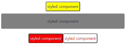
반응형
'front-end & ui > react' 카테고리의 다른 글
| react react-toastify (0) | 2023.06.09 |
|---|---|
| react redux redux-toolkit (0) | 2023.04.13 |
| react cors proxy (0) | 2023.03.09 |
| react v18 UseTransition, useDeferredValue hook (0) | 2022.06.07 |
| react file upload, dropzone (0) | 2022.04.13 |
'front-end & ui/react' Related Articles
more

Comments