| 일 | 월 | 화 | 수 | 목 | 금 | 토 |
|---|---|---|---|---|---|---|
| 1 | 2 | 3 | 4 | |||
| 5 | 6 | 7 | 8 | 9 | 10 | 11 |
| 12 | 13 | 14 | 15 | 16 | 17 | 18 |
| 19 | 20 | 21 | 22 | 23 | 24 | 25 |
| 26 | 27 | 28 | 29 | 30 | 31 |
- window
- 보조정렬
- xPlatform
- Spring
- table
- R
- 정렬
- maVen
- Sqoop
- hadoop
- IntelliJ
- Android
- Python
- Eclipse
- vaadin
- JavaScript
- 공정능력
- tomcat
- Java
- NPM
- MSSQL
- SPC
- SQL
- mapreduce
- GIT
- react
- mybatis
- Express
- es6
- Kotlin
- Today
- Total
DBILITY
독거 가능성 100% 노후에 라면값이라도 하게 센스를 발휘합시다!😅
Please click on the ad so that I can pay for ramen in my old age!
点击一下广告,让老后吃个泡面钱吧!
老後にラーメン代だけでもするように広告を一回クリックしてください。
python matplot bar chart example 본문
그냥 해봤다. 상세한 옵션들은 매뉴얼을 참고.
figure로 chart의 크기를 바꿀 수 있다. figzie=(10,5)에서 tuple 값은 inch(?)
다른 차트들은 공식사이트 Examples를 참고 https://matplotlib.org/stable/gallery/index.html
Gallery — Matplotlib 3.4.3 documentation
Gallery This gallery contains examples of the many things you can do with Matplotlib. Click on any image to see the full image and source code. For longer tutorials, see our tutorials page. You can also find external resources and a FAQ in our user guide.
matplotlib.org
matplolib의 rgb color는 여기를 참고 https://matplotlib.org/stable/tutorials/colors/colors.html
Specifying Colors — Matplotlib 3.4.3 documentation
Note Click here to download the full example code Specifying Colors Matplotlib recognizes the following formats in the table below to specify a color. Format Example RGB or RGBA (red, green, blue, alpha) tuple of float values in a closed interval [0, 1]. (
matplotlib.org
import random

import matplotlib.pyplot as plt
from pandas import DataFrame

raw_data = {
    'observation': range(0, 20),
    'individual_value':
        [0.529, 0.55, 0.555, 0.541, 0.559, 0.543, 0.557, 0.559, 0.581, 0.551,
         0.493, 0.534, 0.527, 0.511, 0.565, 0.559, 0.519, 0.562, 0.551, 0.53
         ]
}
data = DataFrame(raw_data)
# print(data)
colors = []

for i in range(0, len(data['observation'])):
    colors.append((random.random(), random.random(), random.random()))

plt.figure(figsize=(10, 5))

plt.text(x=10, y=0.25, s='hyperrookie@gmail.com', rotation=0, color='whitesmoke', horizontalalignment='center',
         verticalalignment='center',
         fontsize=20, fontweight='bold')

plt.title('bar chart', fontsize=22)
plt.xlabel('observation')
plt.ylabel('individual_value')

plt.ylim(0, data['individual_value'].max() * 1.5)
plt.xlim(-1, data['observation'].size)
plt.bar(data['observation'], data['individual_value'], color=colors)
plt.legend(['dummy value'])

plt.show()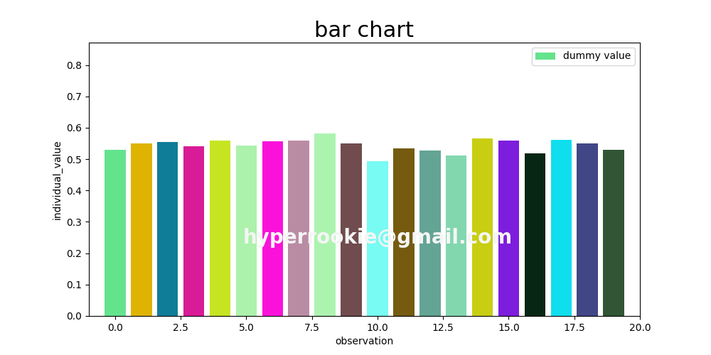
'python' 카테고리의 다른 글
| python papago translate api example (0) | 2021.10.12 |
|---|---|
| python matplot pie chart (0) | 2021.08.30 |
| python matplot line chart example (0) | 2021.08.25 |
| python regular expression ( 정규 표현식 ) (0) | 2021.08.20 |
| python 메일보내기 (0) | 2021.08.19 |


